3 Type Of Charts
Let’s take a look at the three most popular types of forex charts:
- Line chart
- Bar chart
- Candlestick chart
Now, we’ll explain each of the forex charts, and let you know what you should know about each of them.
Line Charts
A simple line chart draws a line from one closing price to the next closing price. When strung together with a line, we can see the general price movement of a currency pair over a period of time.
Here is an example of a line chart for EUR/USD:

Bar Charts
A bar chart is a little more complex. It shows the opening and closing prices, as well as the highs and lows. The bottom of the vertical bar indicates the lowest traded price for that time period, while the top of the bar indicates the highest price paid.
The vertical bar itself indicates the currency pair’s trading range as a whole.
The horizontal hash on the left side of the bar is the opening price, and the right-side horizontal hash is the closing price.
Here is an example of a bar chart for EUR/USD:

A bar is simply one segment of time, whether it is one day, one week, or one hour. When you see the word ‘bar’ going forward, be sure to understand what time frame it is referencing.
Bar charts are also called “OHLC” charts, because they indicate the Open, the High, the Low, and the Close for that particular currency. Here’s an example of a price bar:

High: The top of the vertical line defines the highest price of the time period
Low: The bottom of the vertical line defines the lowest price of the time period
Close: The little horizontal line on the right is the closing price
Candlesticks Charts
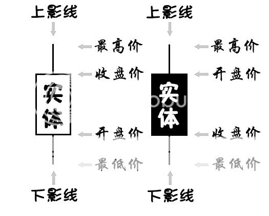
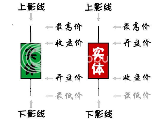
Candlestick charts show the same price information as a bar chart, but in a prettier, graphic format.
Candlestick bars still indicate the high-to-low range with a vertical line.
However, in candlestick charting, the larger block (or body) in the middle indicates the range between the opening and closing prices. Traditionally, if the block in the middle is filled or colored in, then the currency pair closed lower than it opened.
In the following example, the ‘filled color’ is black. For our ‘filled’ blocks, the top of the block is the opening price, and the bottom of the block is the closing price. If the closing price is higher than the opening price, then the block in the middle will be “white” or hollow or unfilled.

A color television is much better than a black and white television, so why not splash some color on those candlestick charts?
We simply substituted green instead of white, and red instead of black. This means that if the price closed higher than it opened, the candlestick would be green.
If the price closed lower than it opened, the candlestick would be red.
In our later lessons, you will see how using green and red candles will allow you to “see” things on the charts much faster, such as uptrend/downtrends and possible reversal points.
For now, just remember that on forex charts, we use red and green candlesticks instead of black and white and we will be using these colors from now on.
Check out these candlesticks…BabyPips.com style! Awww yeeaaah! You know you like that!

Here is an example of a candlestick chart for EUR/USD. Isn’t it pretty?

- Candlesticks are easy to interpret, and are a good place for beginners to start figuring out forex chart analysis.
- Candlesticks are easy to use! Your eyes adapt almost immediately to the information in the bar notation. Plus, research shows that visuals help with studying, so it might help with trading as well!
- Candlesticks and candlestick patterns have cool names such as the “shooting star,” which helps you to remember what the pattern means.
- Candlesticks are good at identifying market turning points – reversals from an uptrend to a downtrend or a downtrend to an uptrend. You will learn more about this later.
Now that you know why candlesticks are so cool, it’s time to let you know that we will be using candlestick forex charts for most, if not all of forex chart examples on this site.
图表的类型
让我们来看看最普遍的三种图表类型:
1.曲线图
2.竹棒图
3.蜡烛图
现在,我们会解释每一种类型的图表,并且让你了解每种类型的不同。
曲线图
一张简单的曲线图,就是把某一段时间内的所有收盘价用直线连接起来。当收盘价都连成一列的时候,我们可以看出货币对在某段时间内,价格的主要波动。
这是一个 欧元/美元 的折线图例子: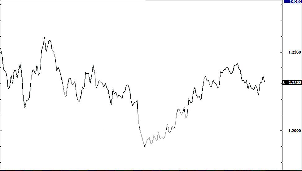
竹棒图
竹棒图是比较有点复杂。它同时显示出开盘价和收盘价,以及最高价和最低价。竹棒的底部代表一段时间内的最低价,而顶部代表最高价。
每根竹棒,代表货币对一段时间内的波动。
在竹棒左边的小横线代表开盘价,而右边的小横线代表收盘价。
这是一个 欧元/美元 的竹棒图例子: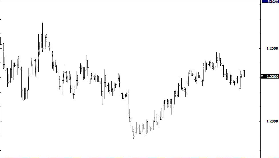
注意一下,在我们的课程中,你常会看到“竹棒”这个词,它是代表图表的一段价格数据。
每根竹棒只是简单的表示一小段时间,不管是:一天、一周 ,还是一个小时。所以当你看到分析时使用“竹棒”这字眼,一定要先弄明白,它代表的是哪一个时间段。
竹棒图也称为“OHLC”图,因为它们同时显示货币对价格的Open、High、Low 和Close。这里是个价格竹棒的例子:
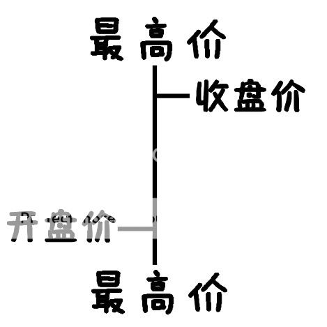
Open:左边的小横线是开盘价。
High:竹棒的顶部代表最高价。
Low:竹棒的底部代表最低价。
Close:右边的小横线是收盘价。
蜡烛图
蜡烛图和竹棒图虽然显示相同的信息,但蜡烛图却使用更好看、更直观式的图形,把价格波动表式出来。
蜡烛图同样是,使用垂直线来显示,从最高价 到最低价 的价格。
然而,在蜡烛图表上,有个大方块(或身躯)在指标的中间,大小的范围在从开盘价到收盘价。一般上,如果在中间的方块填上色彩,就代表该货币对的收盘价低于开盘价。
在下面的例子中,使用的填充颜色是黑。我们填充的区域,其顶部是开盘价,底部的是收盘价。如果收盘价高于开盘价,那么在中间的区域将会是白色或者是中空,没有填充的。
在BabyPips这儿,我们不喜欢使用传统的黑白蜡烛图。他们看起来不是那么的吸引人。同时我们需要花费很多时间来研究图表,所以我们认为添加了彩色的图表,看起来更加的简单。
就像彩色电视总比黑白的电视更好,所以为什么不漆上一些颜色,在这些蜡烛图上呢。
我们只是简单的用绿色代替白色,用红色代替黑色。这就意味着当如果收盘价高于开盘价,蜡烛将会变成绿色。
如果价格的收盘价低于开盘价时,蜡烛将会变成红色的。
在我们接下来的课程中,你将会看到红绿色的蜡烛图,它将会使你更迅速地观察表格上的变化,例如上升/下跌的趋势以及可能的反转点。
现在,请你记得我们使用的是红绿色的蜡烛图,而不是黑白色的。从现在开始,我们将使用这些彩色的蜡烛。
看看这些蜡烛 … … BabyPips的风格!啊啊耶耶耶!你知道你会喜欢这风格的。
这是一幅欧元/美元的彩色蜡烛图例子,是不是很精致?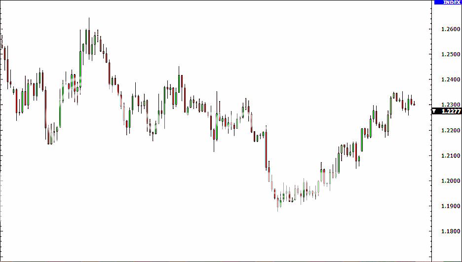
蜡烛图的目的是提供一种完全视觉化的辅助,因为同样的数据也出现在OHLC竹棒图上。蜡烛图的主要优势是:
● 蜡烛图非常易于理解,是初学者刚开始学习图表分析时,最好的工具。
● 蜡烛图非常直观易看!你的眼睛几乎立刻能理解蜡烛间的表示的信息。另外,研究也表明,
形象化的东西有助于钻研学习,它可能会有助于你的交易。
● 蜡烛图和蜡烛形态的都有厉害的名字,像流星、三个白色武士等,
这些取名能帮助你更快的记得这些形态的含义。
● 蜡烛图非常擅于辨认市场的趋势反转 —— 不管是由上升趋势反转下跌趋势,
还是下降趋势反转成上涨趋势。你将在之后的课程学到更多。
现在你知道了蜡烛图为什么那么的厉害,也是时候让你知道,在接下来的课程中,我们大多数会使用蜡烛图,除了一些不是出自BabyPips的图表可能会例外。